Readings Newsletter
Become a Readings Member to make your shopping experience even easier.
Sign in or sign up for free!
You’re not far away from qualifying for FREE standard shipping within Australia
You’ve qualified for FREE standard shipping within Australia
The cart is loading…


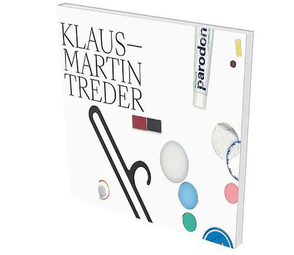
Paintings - Objects - PostersOne series of acrylic paintings by Klaus-Martin Treder (*1961) is called Orientierungsverlust und AEsthetik (loss of orientation and aesthetics). His oeuvre in contrast is structured into three clearly distinguishable formats, so that loss of orientation may well be understood as the motif of the works rather than the modus operandi of their creation. Paintings and works of paper are grouped together as paintings in series and groups of works, then there are his objects and, furthermore, his posters . His work is full of self-referential technical and discursive references, as well as those re ferencing something external. By freely combining the individual production steps, the artist assembles skins of paint, slender drop cascades and even clumsy garlands on dripped and poured color bases. As a result, individual elements protrude precariously from the image surface, exceed the boundary, to gently move in a draft of air, or risk falling off even with careful handling. This under lines the object character inevitably inherent in painted images, and at the same time raises the question of the space that allows a painting to be presented and understood as such. The question of the impact and significance of images is further exacerbated by elements applied to the image surface–a motley repertoire of familiar items from everyday life: candies and sweets, lipstick and shampoo, coffee beans and ties, asthma inhalers and paint tubes, even hair of the head and body. There is a striking chromaticity that is neither expressive nor formalistic. The conceptual materialization of paint straight from the tube– readymade as it were!–in this case redefines the ontological status of painting as an institution in art. The book is designed according to a concept by the artist where a four-sided, differently colored, yet blank sheet is placed around every second printed sheet, thus activating a kind of contem plative pause . This volume thus provides a true pleasure for lovers of book art, it is something to hold in your hands, to leaf through, to move and to linger with for a moment.
$9.00 standard shipping within Australia
FREE standard shipping within Australia for orders over $100.00
Express & International shipping calculated at checkout
Paintings - Objects - PostersOne series of acrylic paintings by Klaus-Martin Treder (*1961) is called Orientierungsverlust und AEsthetik (loss of orientation and aesthetics). His oeuvre in contrast is structured into three clearly distinguishable formats, so that loss of orientation may well be understood as the motif of the works rather than the modus operandi of their creation. Paintings and works of paper are grouped together as paintings in series and groups of works, then there are his objects and, furthermore, his posters . His work is full of self-referential technical and discursive references, as well as those re ferencing something external. By freely combining the individual production steps, the artist assembles skins of paint, slender drop cascades and even clumsy garlands on dripped and poured color bases. As a result, individual elements protrude precariously from the image surface, exceed the boundary, to gently move in a draft of air, or risk falling off even with careful handling. This under lines the object character inevitably inherent in painted images, and at the same time raises the question of the space that allows a painting to be presented and understood as such. The question of the impact and significance of images is further exacerbated by elements applied to the image surface–a motley repertoire of familiar items from everyday life: candies and sweets, lipstick and shampoo, coffee beans and ties, asthma inhalers and paint tubes, even hair of the head and body. There is a striking chromaticity that is neither expressive nor formalistic. The conceptual materialization of paint straight from the tube– readymade as it were!–in this case redefines the ontological status of painting as an institution in art. The book is designed according to a concept by the artist where a four-sided, differently colored, yet blank sheet is placed around every second printed sheet, thus activating a kind of contem plative pause . This volume thus provides a true pleasure for lovers of book art, it is something to hold in your hands, to leaf through, to move and to linger with for a moment.
Search our extensive online catalogue.
