Readings Newsletter
Become a Readings Member to make your shopping experience even easier.
Sign in or sign up for free!
You’re not far away from qualifying for FREE standard shipping within Australia
You’ve qualified for FREE standard shipping within Australia
The cart is loading…


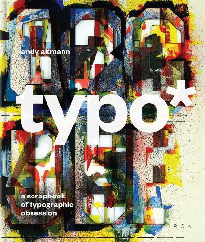
Designer Andy Altmann has been pursuing an obsession with typographic oddities for more than 30 years; and he's not necessarily interested in the kind of thing you might expect. He delights in the weird and wonderful and finds inspiration in the ordinary. At last, he has organised his typographic hits and misses in a 400-page, whopper of a scrapbook. Conceived and edited by Andy, typo* is a cornucopia of curiosities. Between its covers you'll find everything from Swiss minimalism to Victorian street signs, from soap packets to magazine covers, from high art to the handmade. Essential is too small a word for this book: every graphic designer and typographer should have a copy. Keep it by the keyboard or refer to it secretly when stuck for an idea, you'll wonder how you ever managed without it. typo (noun): an error (as of spelling) in typed or typeset material; (abbr.) typography or typographer AUTHOR: Andy Altmann has an independent design consultancy, based in London. He was a founding partner at Why Not Associates ? one of the UK's leading multi-disciplinary design companies. Andy founded Why Not Associates in 1987, with fellow Royal College of Art graduates David Ellis and Howard Greenhalgh. Although he trained as a graphic designer, Andy's work has taken him into the blurred boundaries of design and art. In over 30 years of experience he has worked on projects ranging from exhibition design to postage stamps, via advertising, publishing, television titles, commercials, corporate identity and large-scale public art. His clients include the Royal Academy of Arts, Channel 4, V&A, Grace Jones, Pompidou Centre, Royal Mail, Nike, Paul Smith, Chris Ofili, Kobe Museum of Fashion, and Tate Modern. All his work is bound by a fundamental love of typography, research and experimentation. He has given numerous lectures on his work all around the world ? from Siberia to Japan via Manchester! In 1991 Why Not Associates collaborated with Edward Booth-Clibborn and Rick Poyner to edit and design Typography Now: The Next Wave ? which became the most significant, most referenced, best selling survey of typographic trends and thinking of its time. A monograph was published in 1998, documenting the first ten years of Why Not Associates' work and a second, published in 2004, documented another five years. SELLING POINTS: . An unrivalled source book of inspirational typographic ephemera . A companion volume to the critically acclaimed tat . A visual treasure trove, completely eclectic and full of surprises 400 colour illustrations
$9.00 standard shipping within Australia
FREE standard shipping within Australia for orders over $100.00
Express & International shipping calculated at checkout
Designer Andy Altmann has been pursuing an obsession with typographic oddities for more than 30 years; and he's not necessarily interested in the kind of thing you might expect. He delights in the weird and wonderful and finds inspiration in the ordinary. At last, he has organised his typographic hits and misses in a 400-page, whopper of a scrapbook. Conceived and edited by Andy, typo* is a cornucopia of curiosities. Between its covers you'll find everything from Swiss minimalism to Victorian street signs, from soap packets to magazine covers, from high art to the handmade. Essential is too small a word for this book: every graphic designer and typographer should have a copy. Keep it by the keyboard or refer to it secretly when stuck for an idea, you'll wonder how you ever managed without it. typo (noun): an error (as of spelling) in typed or typeset material; (abbr.) typography or typographer AUTHOR: Andy Altmann has an independent design consultancy, based in London. He was a founding partner at Why Not Associates ? one of the UK's leading multi-disciplinary design companies. Andy founded Why Not Associates in 1987, with fellow Royal College of Art graduates David Ellis and Howard Greenhalgh. Although he trained as a graphic designer, Andy's work has taken him into the blurred boundaries of design and art. In over 30 years of experience he has worked on projects ranging from exhibition design to postage stamps, via advertising, publishing, television titles, commercials, corporate identity and large-scale public art. His clients include the Royal Academy of Arts, Channel 4, V&A, Grace Jones, Pompidou Centre, Royal Mail, Nike, Paul Smith, Chris Ofili, Kobe Museum of Fashion, and Tate Modern. All his work is bound by a fundamental love of typography, research and experimentation. He has given numerous lectures on his work all around the world ? from Siberia to Japan via Manchester! In 1991 Why Not Associates collaborated with Edward Booth-Clibborn and Rick Poyner to edit and design Typography Now: The Next Wave ? which became the most significant, most referenced, best selling survey of typographic trends and thinking of its time. A monograph was published in 1998, documenting the first ten years of Why Not Associates' work and a second, published in 2004, documented another five years. SELLING POINTS: . An unrivalled source book of inspirational typographic ephemera . A companion volume to the critically acclaimed tat . A visual treasure trove, completely eclectic and full of surprises 400 colour illustrations