This title is printed to order. This book may have been self-published. If so, we cannot guarantee the quality of the content. In the main most books will have gone through the editing process however some may not. We therefore suggest that you be aware of this before ordering this book. If in doubt check either the author or publisher’s details as we are unable to accept any returns unless they are faulty. Please contact us if you have any questions.
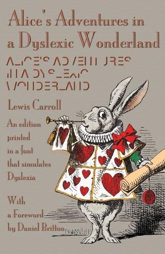
In 2013, Daniel Britton initiated a project at the London College of Communication to recreate the feeling of reading with dyslexia-to try and instil a sense of empathy between non-dyslexics and dyslexics. To accomplish this, he designed a typeface that would be almost illegible and slow down the reading pace of a non-dyslexic person to the speed of a dyslexic, recreating the frustration and embarrassment of reading with the condition. Britton’s typeface design doesn’t simulate letters jumping around on the page or anything like that-it just breaks the reading time of a non-dyslexic down to the speed of a dyslexic. With fonts specially produced by Michael Everson, this edition has been typeset in keeping with Britton’s design objectives.