Readings Newsletter
Become a Readings Member to make your shopping experience even easier.
Sign in or sign up for free!
You’re not far away from qualifying for FREE standard shipping within Australia
You’ve qualified for FREE standard shipping within Australia
The cart is loading…


This title is printed to order. This book may have been self-published. If so, we cannot guarantee the quality of the content. In the main most books will have gone through the editing process however some may not. We therefore suggest that you be aware of this before ordering this book. If in doubt check either the author or publisher’s details as we are unable to accept any returns unless they are faulty. Please contact us if you have any questions.
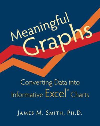
Meaningful Graphs is a concise and practical go-to guide for creating charts in Excel ® that clearly and accurately tell the story in your data. It incorporates (a) explanations of the graph design principles of the experts (Tufte, Few, Robbins, Zelazny, and others), (b) the software steps necessary to incorporate these principles into Excel ® charts, and © chart-related discussions of quality improvement (including Pareto charts), statistics (including run charts and correlations), and the use of graphs in PowerPoint ® presentations (including chart animation). Also included are numerous Tips and In Practice examples drawn from over 35 years of working with data in healthcare settings. Coverage begins with highlighting the importance of knowing the story in your data and general principles of chart design (e.g., chartjunk, the use of color, consideration of three dimensional charts) and then proceeds to examine and create the five major chart types (column, bar, line, pie, scatter). This is followed by considerations of the pros and cons of each of the six less frequently employed chart types. There are over 120 graphs in full color plus tables and illustrations. Discussions of the most useful chart types include examples with accompanying data to facilitate practice. While illustrations are especially tailored for healthcare professionals (physicians, nurses, patient safety, quality improvement staff, executives, and managers) both in their work setting and in their academic preparation, the principles of graph design and the Excel ® techniques required to incorporate these principles apply equally well in other settings. The latter include other industries and academic programs, including those leading to degrees in business administration (MBA), public health (MPH), and public administration (MPA). If you follow the advice in this book, the graphs you create for reports, presentations, posters, or publications will be more informative and more easily understood.
$9.00 standard shipping within Australia
FREE standard shipping within Australia for orders over $100.00
Express & International shipping calculated at checkout
This title is printed to order. This book may have been self-published. If so, we cannot guarantee the quality of the content. In the main most books will have gone through the editing process however some may not. We therefore suggest that you be aware of this before ordering this book. If in doubt check either the author or publisher’s details as we are unable to accept any returns unless they are faulty. Please contact us if you have any questions.
Meaningful Graphs is a concise and practical go-to guide for creating charts in Excel ® that clearly and accurately tell the story in your data. It incorporates (a) explanations of the graph design principles of the experts (Tufte, Few, Robbins, Zelazny, and others), (b) the software steps necessary to incorporate these principles into Excel ® charts, and © chart-related discussions of quality improvement (including Pareto charts), statistics (including run charts and correlations), and the use of graphs in PowerPoint ® presentations (including chart animation). Also included are numerous Tips and In Practice examples drawn from over 35 years of working with data in healthcare settings. Coverage begins with highlighting the importance of knowing the story in your data and general principles of chart design (e.g., chartjunk, the use of color, consideration of three dimensional charts) and then proceeds to examine and create the five major chart types (column, bar, line, pie, scatter). This is followed by considerations of the pros and cons of each of the six less frequently employed chart types. There are over 120 graphs in full color plus tables and illustrations. Discussions of the most useful chart types include examples with accompanying data to facilitate practice. While illustrations are especially tailored for healthcare professionals (physicians, nurses, patient safety, quality improvement staff, executives, and managers) both in their work setting and in their academic preparation, the principles of graph design and the Excel ® techniques required to incorporate these principles apply equally well in other settings. The latter include other industries and academic programs, including those leading to degrees in business administration (MBA), public health (MPH), and public administration (MPA). If you follow the advice in this book, the graphs you create for reports, presentations, posters, or publications will be more informative and more easily understood.