Someone once asked me if I thought ebooks would ever fully replace print, and I remember thinking, absolutely not – not while books are such aesthetic objects, even not considering all the other joys a physical book holds. A large part of this is due to the cover – it’s a remarkable artistic medium that is required to do so much: engage the eye, give a sense of the book itself, and also convey all the necessary information such as title, author, etc. It can be hard to put your finger on what it is about a cover that just works; and it is certainly subjective. Below are some of my favourite covers from recent releases.
There are always far too many to choose from, so if you’re interested in cover design, the ABDA awards shortlist is always a great place to look, both for inspiration if you’re a budding designer yourself, and for pure aesthetic joy if not.
Adult
Beautiful Revolutionary by Laura Elizabeth Woollett
Laura Elizabeth Woollett is certainly a writer to watch. Her 2018 novelisation of the events surrounding the Jonestown Massacre is electric, with rich, evocative language and deftly drawn characters. The cover of this book is a remarkable snapshot of tone. The fetid, overheated green jungles of Guyana and a heavy haze of pink, almost evocative of napalm and the Vietnam war that establishes the background setting of the first part of the book, isolate the woman and draw the eye. That combination of lurid pink and green almost screams ‘poison’, perfectly setting the scene for the terrifying chain of events in 1978.
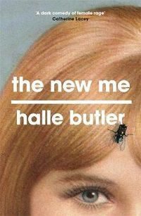
The New Me by Halle Butler
The fly gracing the cover of The New Me is a perfect emblem of the seedy undercurrent to this book. We’ve long associated flies with rot and decay, so to see a fly on the face of a conventionally attractive woman is abject and repulsive. In The New Me a conventional-seeming woman with a conventional-seeming life is barely holding it together. She’s in financial ruin, her health is crumbling, and her neighbours complain of a rank smell emanating from her apartment. All of this is neatly conveyed with that repulsive fly – such a simple design, but effective.
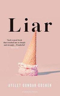
Liar by Ayelet Gundar-Goshen
In Liar, an altercation between server and customer outside an ice-cream shop spirals out of control into an accusation of sexual assault. It’s another remarkably simple but potent cover. Ice-cream, baby pink; these are all emblems of innocence, but here they’ve quite literally been turned on their heads. I once took a film class that said if you want to convey to an audience that something is ‘off’, turn the scene upside down. This method works very well here – we have these conventional, accepted visual tropes, but they’ve been flipped. Straight away (discounting the title, of course) we can know that this story opens with a lie.
Parkland by Dave Cullen
When Nicolas Cruz shot seventeen students and teachers at a school in Florida on 14th February 2018, the story was tragic and familiar. Yet the eighth school shooting that year made history for another reason. The student survivors were galvanised and propelled into action, frustrated by the inactivity of the government. Never again, they said. This cover is another that works because of its simplicity. The symbology of the wire fence with the wilting bouquets, that heartbreaking sign – we all know what they mean, so there’s no need to over-embellish and dilute their power. The big blue emptiness of desolate sky is a strong touch; almost highlighting the isolation and devastation felt by the students. It’s a great example of letting subtext shine.
Kids and YA
Lenny’s Book of Everything by Karen Foxlee
In Lenny’s Book of Everything, two siblings explore the wonders of the world through the lens of their encyclopaedia. They harbour dreams of going on an adventure to Great Bear Lake, but as her brother’s health deteriorates, Lenny comes to accept the inevitable truth; Davey will never make it. This cover is heartbreaking. The freedom of the bird in flight with its mapped interior, locked in against that bright, eye-catching red – to me it gives a sense of something fleeting and unattainable but filled with whimsy, as if the hopes and dreams of these kids are borne on the wings of a bird.
Cicada by Shaun Tan
No list on notable design is complete without reference to multi-award winner Shaun Tan. If I had the space, I’d include all his books, but have whittled it down to Cicada, which may also have one of my favourite endings of the last 12 months (I cried happy tears in the middle of our Carlton store). The beauty of Tan’s designs may be in his ability to bring empathy to inanimate objects, animals, and yes, cicadas, without needing to overhumanise them. The combination of the muted colour scheme and the simplicity of the design – it’s rare to see a cover that so succinctly conveys a feeling. And the payoff of that bright burst of colour in the final pages…
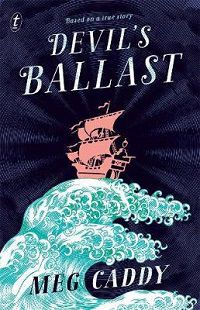
Devil’s Ballast by Meg Caddy
Devil’s Ballast may have one of my favourite female characters of the year. Anne Bonny, legendary pirate queen, is tough as nails, a ruthless pirate and a damn good shot. In the days of yesteryear, it would have been easy to have a cover with a heavily romanticised Anne gracing it – quite often we might have seen her ‘softened’, emphasising her feminity and removing her ruthlessness, showing her without any of the bloodthirsty qualities that make her so interesting. The design of Devil’s Ballast is refreshing and beautifully modern – it’s simple, succinct and establishes the setting and tone of the book without having to compromise the qualities of its lead character.
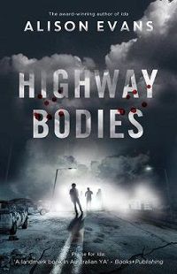
Highway Bodies by Alison Evans
The cover of Alison Evans’ Highway Bodies is a welcome addition to the genre, as is the book itself. Both are refreshing, exciting and bring a new perspective. Most zombie books are covered in blood or the gnashing jaws of some poor undead – the Highway Bodies cover has blood, sure, but its restraint on gore, coupled with the shifting unease of the monochrome scene and lingering mist, and alongside those signifiers (abandoned highway, rusted car) that help a reader understand what kind of story they’re dipping into, establishes a fresh, pithy take on the genre.


